Hydrology Distributions: Part I
Part I in a series about hydrology distributions. Part I goes over descriptive statistics and pmf, pdf and cdf.
By Josh Erickson in R Hydrology
June 7, 2021
library(wildlandhydRo)
library(evd)
library(fitdistrplus)
library(tidyverse)
library(patchwork)
library(latex2exp)
library(moments)
theme_set(theme_bw())
Introduction
This will be part one of a three part blog series ‘Hydrology Distributions’ where we’ll look at different distributions in R using a handful of packages. A lot of times in hydrology you’ll end up collecting data (rainfall, snowdepth, runoff, etc) to try and fit a theoretical distribution for further analysis, e.g. frequency, probabilities, hypothesis testing etc. These probability distributions come in all shapes and sizes (literally) and can be confusing at times but hopefully we can break these concepts down without too much incredulity from those pesky/pedantic statisticians 😊. First (part I), we’ll look at descriptive statistics and probability distributions (pmf and pdf). Second (part II), we’ll bring in some data and compare distributions visually for some commonly used theoretical distributions in hydrology, e.g. normal (N), lognormal (LN), log Pearson type III (LP3), Pearson (P), Gumbel (G), Weibull (W) and Generalized Extreme-value Distribution (GEV). Third (part III), we’ll use a few goodness-of-fit tests to see which theoretical distribution best represents the underlying empirical distribution.
Part I
For part one we will get pretty ‘mathy’ by looking at descriptive stats and probability distributions and how they are derived. This is not meant to be a full blown course into statistics! Thus, I’m assuming the reader has some basic understanding of statistics and calculus but if you want more information please see this book from Maity (2018) titled ‘Statistical Methods in Hydrology and Hydroclimatology’. This book does not have a free copy but is worth the buy if you can. Otherwise, here are some other sources that I think would be relevant to the series (prob-distr, distributions).
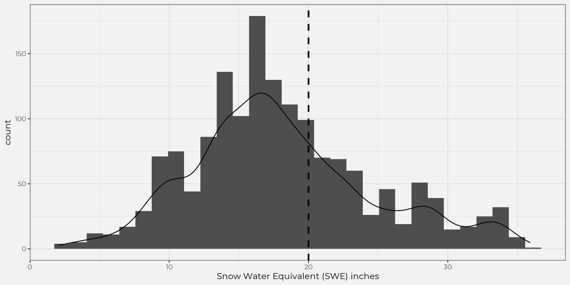
So, what is a distribution? In a basic sense, a distribution is a set of observations (discrete or continuous) that shows how this set is distributed or how frequently values occur, e.g. banfield={1,4,5,5.3,3.546,10,…,n}. This set of observations (banfield) can then be used graphically (plotting), descriptively (central tendency, dispersion, skewness and tailedness) or inferentially (theoretical distributions) to uncover more about the underlying data. So, let’s bring in some daily SWE data from a Snow Telemetry (SNOTEL) site (banfield) and see what the data looks like graphically. We can do this by looking at a histogram (counting) or density plot. This gives us an idea of how the data is distributed and where values frequently occur.
Plotting
banfield <- batch_SNOTELdv(sites = 311)
hist <- ggplot(data = banfield, aes(snow_water_equivalent)) +
  geom_histogram() + labs(title = 'Histogram', x = 'Snow Water Equivalent (SWE) inches')

dens <- ggplot(data = banfield, aes(snow_water_equivalent)) +
  geom_density() + labs(title = 'Density', x = 'Snow Water Equivalent (SWE) inches')

both <- ggplot(data = banfield, aes(snow_water_equivalent, ..count..)) +
  geom_histogram() +
  geom_density() +
  labs(x = 'Snow Water Equivalent (SWE) inches')

(hist | dens ) / both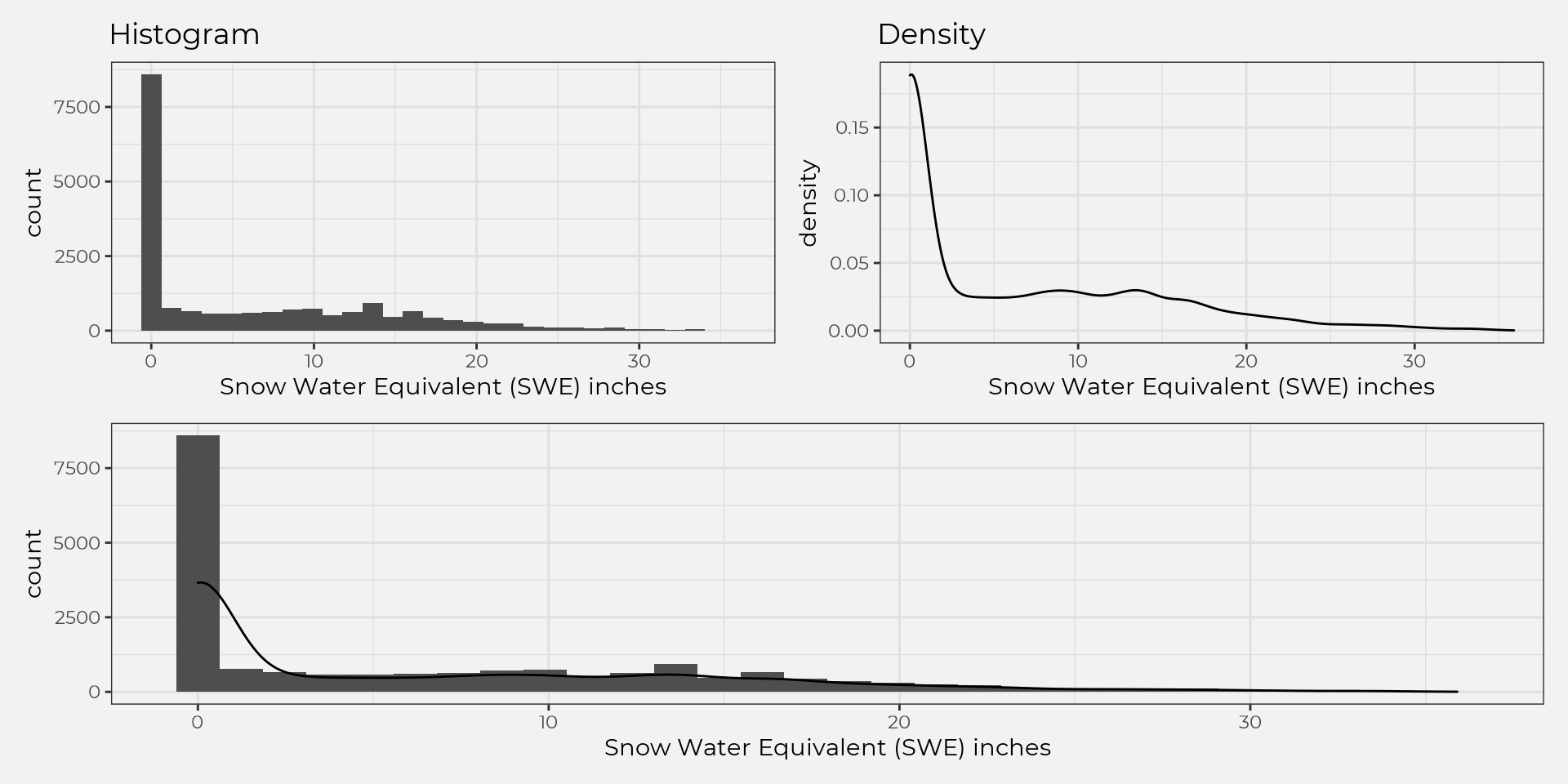
This is fine but as you can see most of the readings are zero (no snow!) so let’s just grab the month of April as this has some significance with runoff, i.e. high April SWE correlates with high runoff.
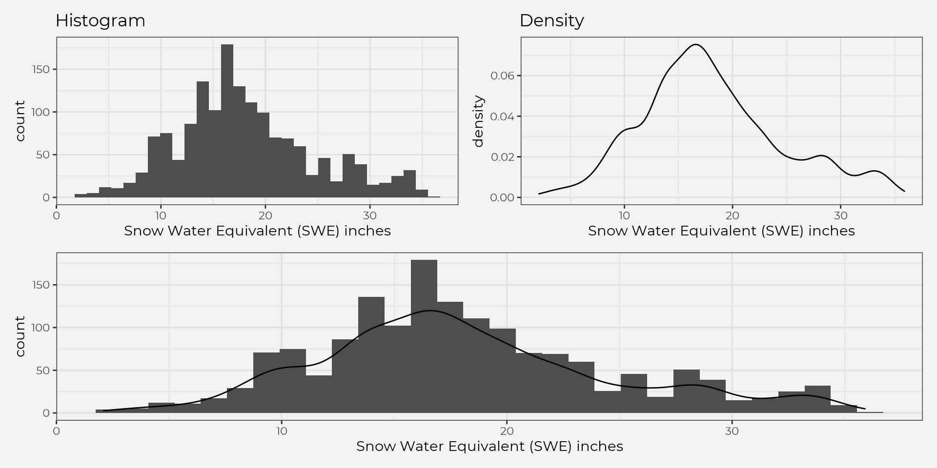
Ahhh, much better! As you can see, we start to get a better idea of how the data is distributed but this is just visual. Sometimes this is all you need but for other times that’s where descriptive statistics come in handy. Destriptive statistics will help us put a number to what we see!
Descriptive Stats
Now we can look at some descriptive stats from these observations (banfield). But first, let’s go over the common stats briefly, e.g. central tendency, dispersion, skewness and tailedness.
Central Tendency
Central tendency describes where the data is most occurring, e.g. mean, median, mode. This helps us understand it’s ‘central tendency’ 😆, which can be useful for inferring population parameters (theretical distributions) or just getting a quick idea of the average. Below are the equations for calculating the mean, median and mode;
μmo=argmaxxi[px(xi)]
Sometimes this is all you need for your analysis; however, this can be misleading (most of time) without knowing other information like dispersion (variance).
Dispersion
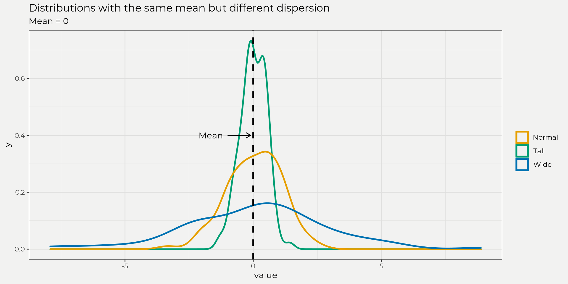
Dispersion is the measure of spread from the central tendency. This is really helpful in that it let’s us know how clustered our data is or is not. For example, you can have the same mean but different dispersion as the figure below shows. This is a big difference, right? This is why providing the mean and standard deviation is so important when reporting data.
Below are the equations for calculating variance and standard deviation;
S=√∑ni=1(xi−ˉx)2n−1
As you can see, the standard deviation is just the square root of the variance. This is nice because it puts it back into the original scale of the data!
Skewness
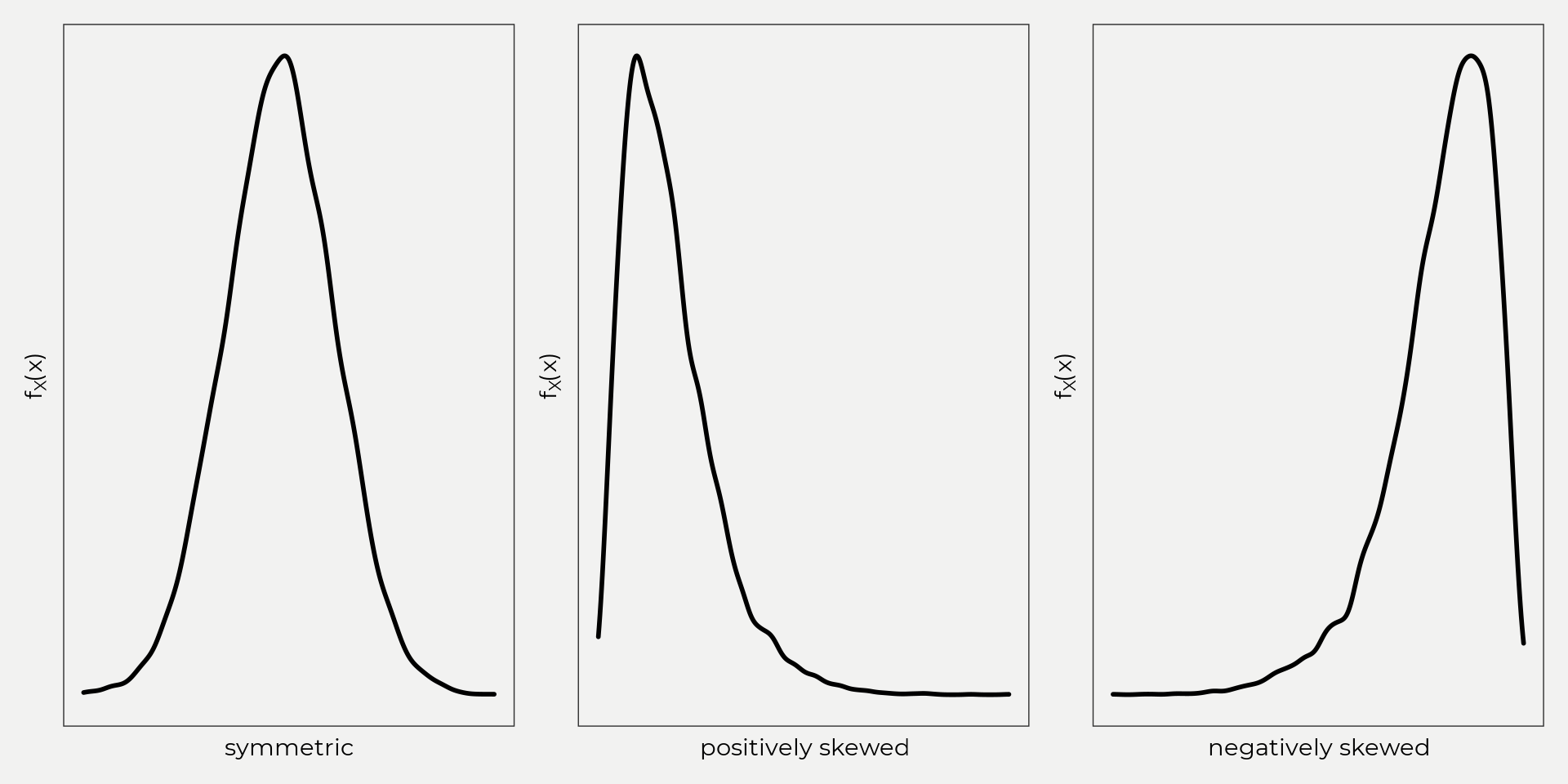
Skewness is the measure of symmetry. In other words, how does our data look on both sides of our central value (mean, median)? Is it symmetric? Is it longer on one side, etc? This is helpful because some data might be skewed right, left or barely at all and that can change how you infer meaning (we’ll go over this later).
Here is the equation below to find coefficient of skewness;
Cs=n∑ni=1(xi−ˉx)3(n−1)(n−2)S3
Tailedness/Kurtosis
Tailedness aka Kurtosis is the measure of the ‘tails’ of the distribution. This is really helpful with outliers in the distribution. Kurtosis gives you an idea of what’s going on at the edges. There are three flavors of kurtosis: mesokurtic, leptokurtic and platykurtic. These are based on different kurtosis values (k=3 is mesokurtic, k > 3 is leptokurtic, k < 3 is platykurtic). When you start playing around with kurtosis you’ll see that it really depends on how heavy areas of the distribution are! See the figure below and notice how the distributions look,
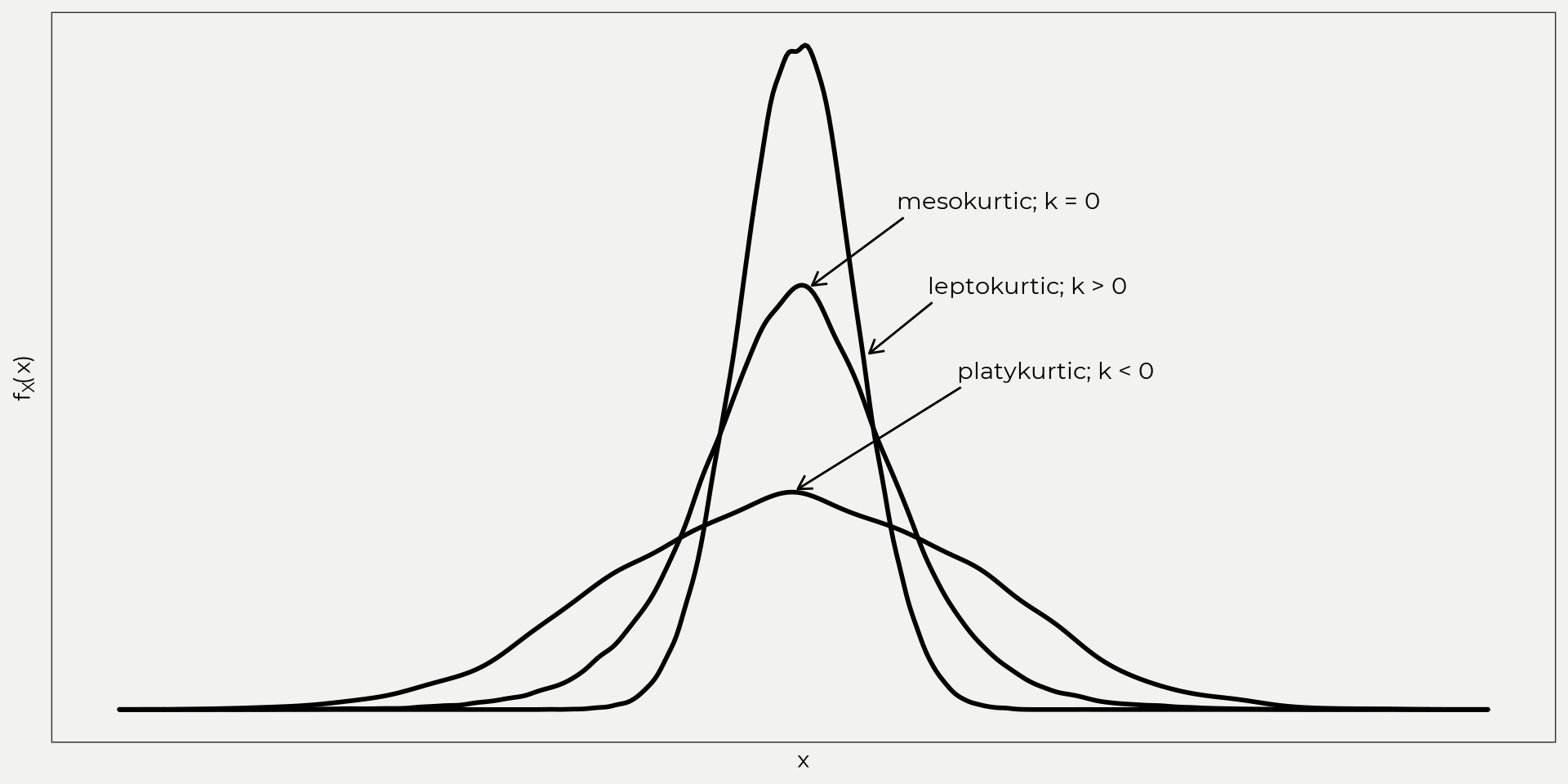
What you can’t see is how heavy the tails are! I had to add more points to the platykurtic distribution near the edges to get a k < 0. Equation for type 3 coefficient of kurtosis.
k=n2∑ni=1(xi−ˉx)4(n−1)(n−2)(n−3)S4
Banfield Stats
Now that we’ve covered descriptive statistics, we can move on and see what the Banfield site looks like.
| Mean | Median | Mode | Variance | Standard Deviation | Skewness | Kurtosis |
|---|---|---|---|---|---|---|
| 18.09 in. | 17.1 in. | 16 in. | 42.84 | 6.55 in. | 0.5 | 2.97 |
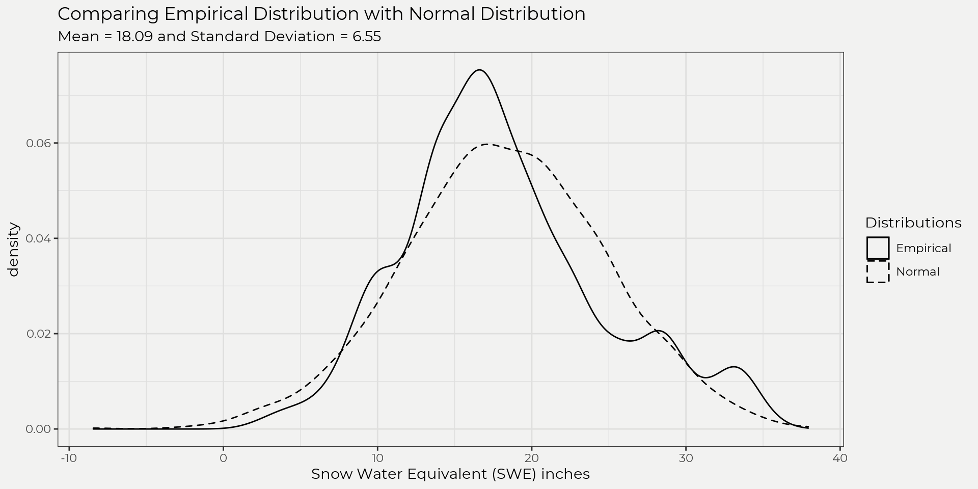
From the table above we can see that the mean, median and mode (central tendancy) are pretty close. The standard deviation is about 6.55 inches (dispersion) and the skewness (measure of symmetry) is positive (0.5) which means skewed to the right. The kurtosis is interesting as it’s close to 3, which indicates that its tails likely follow a normal distribution (mesokurtic).
These handful of stats (table above) are very informative and give us a quick exploratory look into what’s going on with this sample. This can help us understand what the underlying data looks like (without looking) and can give us insights relatively fast but what if we wanted to ask some questions like, ‘what is the probability of seeing a SWE measurement in April above 25 inches?’. This is where we’ll need to introduce the idea of probability distributions.
Probability Distributions (univariate)
For us hydrologists, a univariate probability distribution is composed of randomly sampled data (discrete or continuous) from hydrologic events (rainfall, runoff, snow water equivalent (SWE), days of drought, etc) that we can then infer probabilities from an theoretical or empirical distribution. The main take-away is if we know what the distribution of the data is (empirical) or what it likely follows (theoretical) then we can do some powerful things with probabilities.
Thus, a probability distribution is broken into two different flavors: probability mass function (pmf) and probability density function (pdf). A pmf is made up of randomly sampled discrete data (number of days, months, years, etc) and a pdf is made up of randomly sampled continuous data (rainfall depth, snow depth, runoff). That’s it! Below we’ll dive into the math behind a pmf and pdf and also introduce a Cumulative Distribution Function (CDF), which calculates/cumulates the probabilities.
pmf
The pmf must satisfy,
(i) px(xi)≥0 ∀ xi∈θ
where px(xi) must be greater than or equal to zero for all x in the set and the sum of px(xi) must equal one for all x in the set. Basically, we can’t have a set of values that when you add up them up they don’t equal one. Which makes sense intuitively, we wouldn’t want our sample to only go to 0.75. We can look at this with our (banfield) dataset but first we’ll need to transfer into a discrete value to use as a pmf example (since it’s continuous data right now…).
Let’s see what the number/count of consecutive days of SWE per year is (blah, confusing). In other words, number of days in a row that SWE has increased day-to-day. For example, if you take "2020-04-01 UTC" "2020-04-02 UTC" "2020-04-03 UTC" "2020-04-04 UTC" and have SWE values 1,1,3,2 then this would have one consecutive day with a positive increase at days "2020-04-02 UTC" "2020-04-03 UTC" where SWE goes from 1 to 3 (notice that we’re not counting decreasing days 3 to 2). When doing this we can see that our data closely follows a Poisson Distribution (P(x)=e−λλxx!).
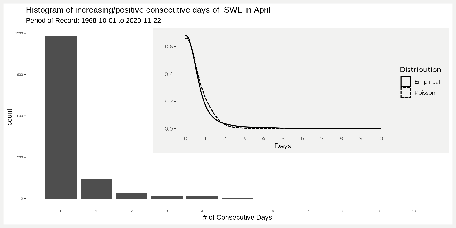
In the figure above there are a lot of zero’s! This is what we would expect for the end of the season around here (more losing water than gaining). The inset figure show’s how it roughly (really really close) follows a Poisson distribution. So what do we do with the pmf?
That’s easy (relative), we just substitute px(xi) for whatever the new distribution is; in our case that’s a Poisson distribution (e−λλxx! where λ=0.2). Replace. And voila ∑all ie−λλxx! where λ=0.2. From here, we just have to ask a question like ‘what is the probability that there will be 0 consecutive days in April?’. All we do is plug in 0 to the Poisson Distribution and magic happens (wait no, no magic just a function being calculated). So,
P(X=0)=px(0)=e−0.20.200!=0.819
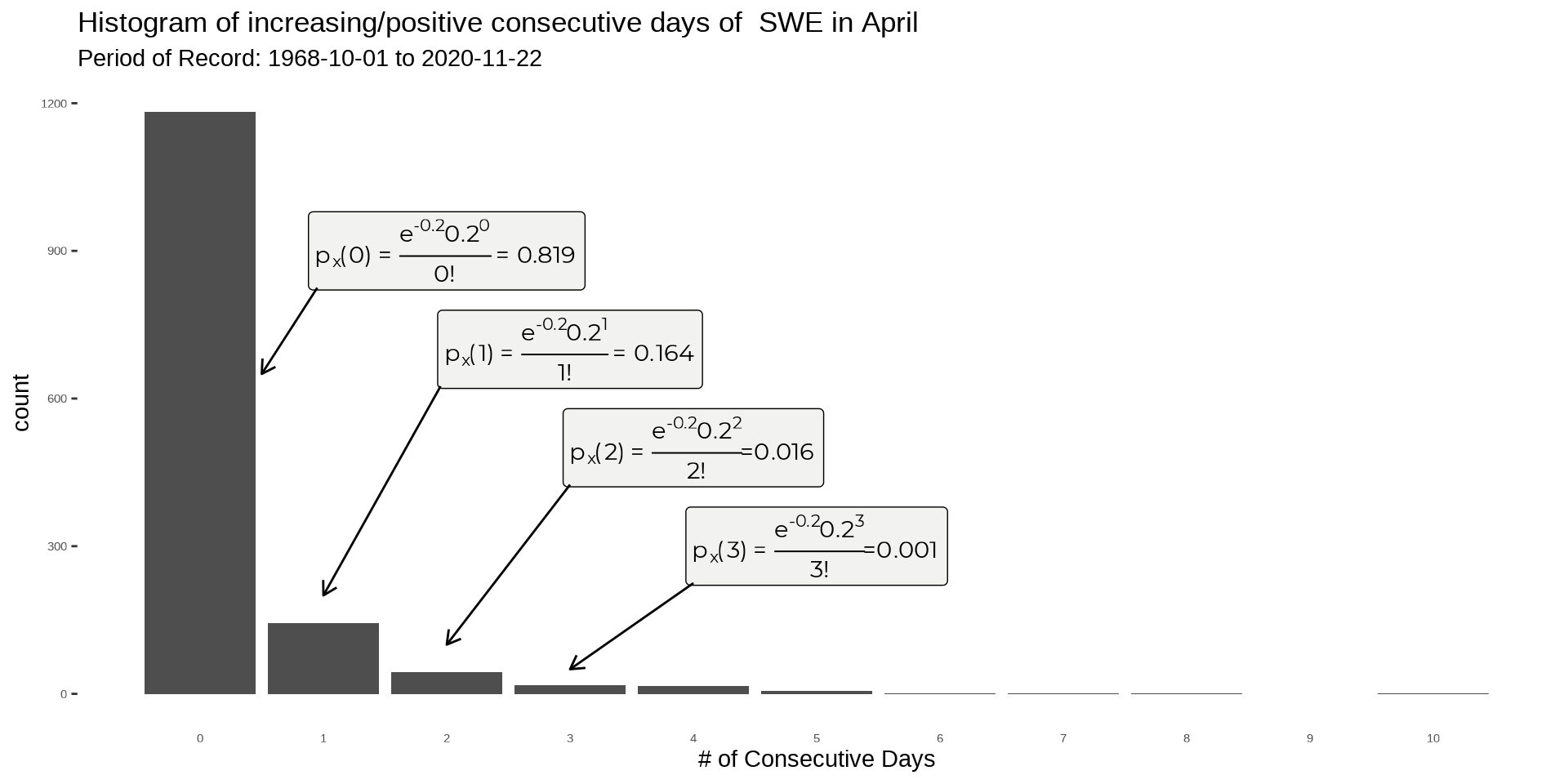
What about 10? Easy, just substitute x for 10
px(10)=e−0.20.21010!=2.31e−14
P(1≤X≤30)=∑all ie−λλxixi! where λ=0.2 ∀ xi∈{1,2,3,4,…,30}
we can then sum up all the probabilities greater than and equal to one to find P(1≤X≤30). We can do this real quick in R using the {purrr} package with the map function. The result is 0.181.
seq(1,30,1) %>% map(function(x)(exp(-0.2)*0.2^x)/factorial(x)) %>% unlist() %>% sum()Now if we add these together P(X=0)+P(1≤X≤30) we should get 1, right? (remember it must follow the pmf rules, see eq. (ii)). And, drumroll… we do (0.8187308 + 0.1812692 = 1)! We just used some hydrodrologic data (SWE) to find the probability of P(1≤X≤30) and P(X=0), how cool is that? But what about that thing called the CDF? The methods above (finding probabilities at different values and summing) are technically a CDF!
Fx(xi)=P(X≤xi)=i∑j=iP(X=xj) ∀x∈{x1,x2,x3,…,xn}
However, the CDF does it a different way with intervals than the way we did it by using P(1≤X≤30)=Fx(30)−Fx(1). This is very subtle (px(xi) vs. FX(x)) but very important. To calculate the interval CDF we need to follow this formula below,
For 0<k≤x≤kFx(x)=px(0)+px(1)+⋯+px(k)P(X)=Fx(xi)−Fx(xi)
Now if we want to find the P(1≤X≤30) using CDF we can! Just input the values into the equation above and we’ll get the same result as if summing up the interval.
P(1≤x≤30)=Fx(30)−Fx(1)Fx(30)=px(0)+px(1)+⋯+px(30)=1Fx(1)=px(0)=0.819P(1≤x≤30)=1−0.819=0.181
They match! Let’s move onto continuous data and explore a pdf!
Make sure to pay attention to ≤ and ≥ and < or > when using CDF’s with pmf’s. It is fine to add ≤, ≥, < or > when using CDF’s but the signs matter for pmf’s! This is not the case with pdf’s as we’ll see in a little bit.
With pdf’s we can start working with contiuous data. This is nice since the banfield data is continuous to start out. First we’ll go over the pdf just like pmf and then apply with a cdf. There is an important distinction between the two (pmf and pdf) in that a pdf is not a point probability and a pmf is. That is to say, if we were to take a point estimate with a pdf then that value is a probability density and not a probability value. Nevertheless.
The pdf must satisfy,
(i) f(x)≥0 for all x
 Just like the pmf we can take a probability density function f(x) and use it to figure out probabilities for different ranges. In our case, f(x)=1√2πσ2e−(x−μ)2/2σ2, (aka the pdf of the normal distribution) and it can be used to answer questions like ‘what is the probability that we have a SWE value ≥ 20?’. Instead of summing up the point probabilities like a pmf we’ll integrate from 20 to ∞. Just like the CDF for a pmf but now we will use integration to find the probability.
Fx(x)=P(X≥20)=∫∞201√2πσ2e−(x−μ)2/2σ2= ?integrate() but first we’ll need to find the Z value at 20. The Z-value is equal to Z=(value−¯x)s2, so mean = 18.09 and standard deviation = 6.55 then Z=(20−18.09)6.545=0.29. Now we can calculate the P(X≥20). Below we’ll show using the dnorm() function which is the standard normal distribution (f(x)=f1√2πe−x2/2) and then manually showing the normal distribution pdf with our data stats (mean and sd). They are a little different but not by much… This has to do with the mean and standard deviation of the two and as a side note this is why it is important to match the best fitting distribution!
integrate(dnorm, 0.29, Inf)## 0.3859081 with absolute error < 7.5e-06integrate(function(x)1/(6.545*sqrt(2*pi))*exp(-((x-18.09)^2/(2*6.545^2))), 20, Inf)## 0.3852099 with absolute error < 6.4e-08# or use
## dnorm(.29)
### or take the area of each sliver of density*width and sum,
### you'll notice it's different and that's because we are using
### the mean = 18.09 and sd = 6.545.
### Another topic, but they're different. Think about it....
### sum(dnorm(seq(20,30,0.00001), mean = 18.09, sd = 6.545)*0.00001)We ended up getting a probability of 0.386 or 38.6%. This makes sense though if we look at the curve and eyeball as seen in the graph below.
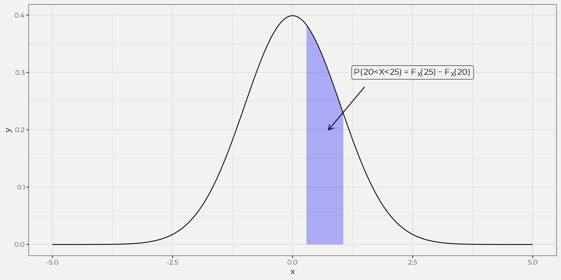
If we want to find it using a interval CDF we still use the same equation as the pmf, e.g. P(20<X<25)=FX(25)−FX(20). Now we need to integrate from 0 to 20 and 0 to 25.
Important note! Make sure to pay attention to ≤ and ≥ when using CDF’s with pdf’s. It is fine to add ≤ and ≥ instead of < or > for pdf’s but technically it’s not a point probability, e.g. P(X=d)=∫ddf(x)dx=0! In other words, don’t assume P(X=20) to give you a point probability when working with pdf’s (only special cases like zero-inflated daily rainfall, etc)…
P(20<X<25)=∫2501√2πσ2e−(x−μ)2/2σ2−∫2001√2πσ2e−(x−μ)2/2σ2∫2501√2πσ2e−(x−μ)2/2σ2=0.854∫2001√2πσ2e−(x−μ)2/2σ2=0.614P(20<X<25)=0.854−0.614=0.24
We can see the chunk of the normal distribution that we took out. We take the 20 and 25 and convert to Z values and then integrate using the normal distribution. This is why it is nice to fit to a theoretical distribution, i.e. don’t have to reinvent the wheel. The result is the area under the curve and the associated CDF aka probability of 20 to 25 inches of SWE in April!
Hopefully this will help you understand hydrologic data better in the context of pmf, pdf and CDF. This will also help for upcoming flood frequency and goodness of fit blogs in the future. Thanks and hope you enjoyed!
References
Maity, R. (2018). Statistical methods in hydrology and hydroclimatology. Springer.